SLIDE
GALLERY

Below are just a few examples of our work. We can help you craft and deliver to your audience exactly the right message through thoughtful and carefully-created slides.
Many of these slides, and much more, are available for purchase in PowerPoint file form.
Click here to visit our on-line store!
BEFORE

AFTER

OTHER EXAMPLES
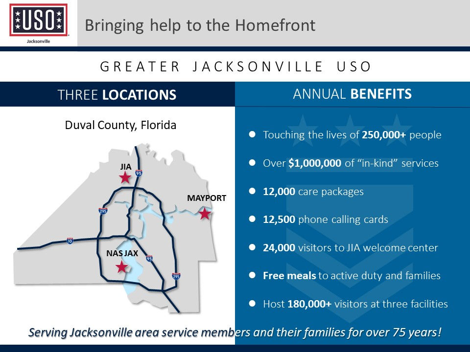
Great slide showing locations and benefits of local Jacksonville USO locations.
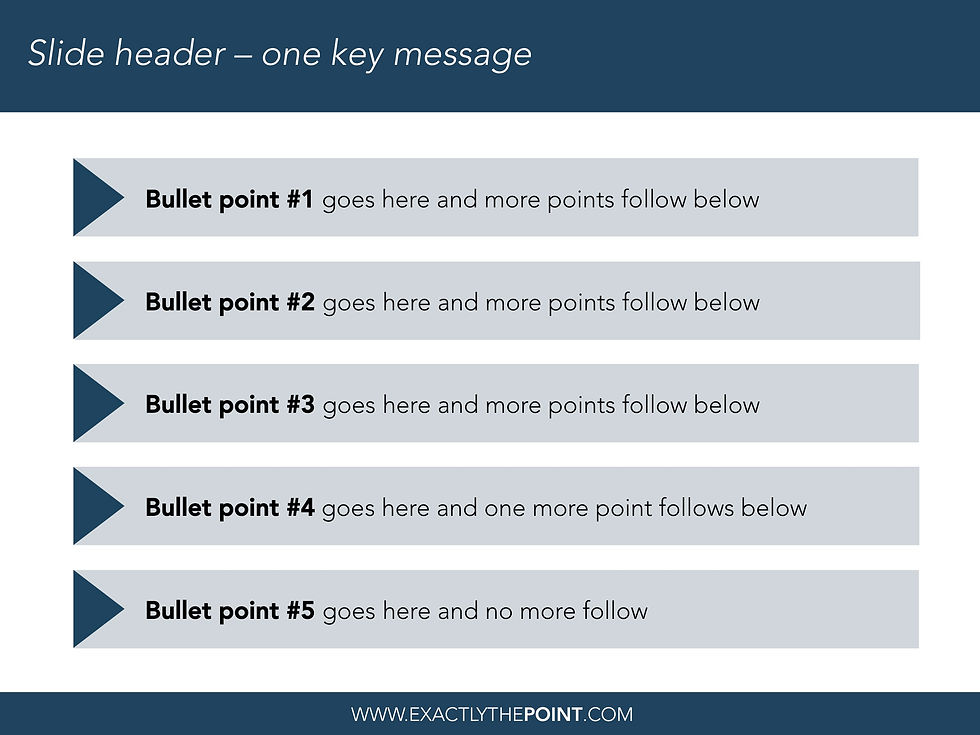
A great way to visually set apart five important points you will be covering throughout your presentation.

Add a sub-title and even a secondary message to your list of bullet points.

Tell your audience why you are speaking to them by utilizing this simple, yet effective slide.

The stacked Venn Diagram uses different sized circles based on the values they represent.
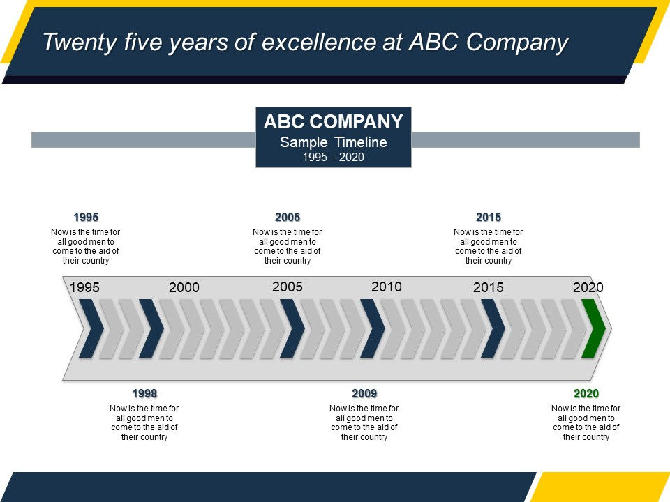
Timeline charts can be designed in many forms and are often used to highlight significant events in time.

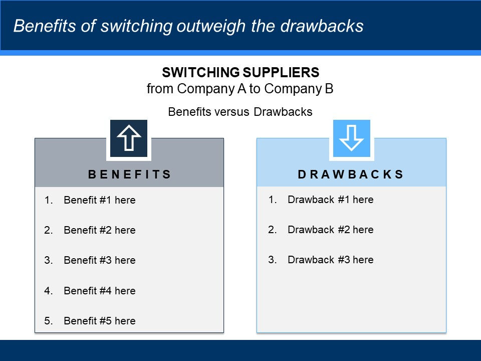
Use this slide to highlight several important points. The number of points can be easily changed too.
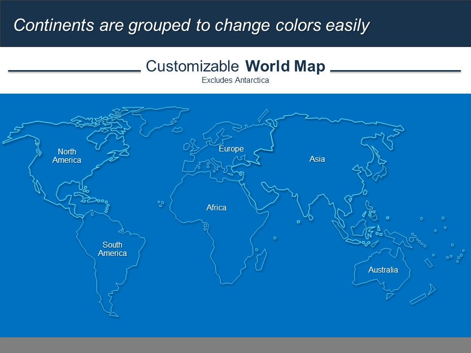
This blue-on-blue world map has a very clean look.

This map was created by hand, state-by-state. Individual states or regions can be highlighted too.

We can custom create any map for you with an accompanying table, picture, etc.
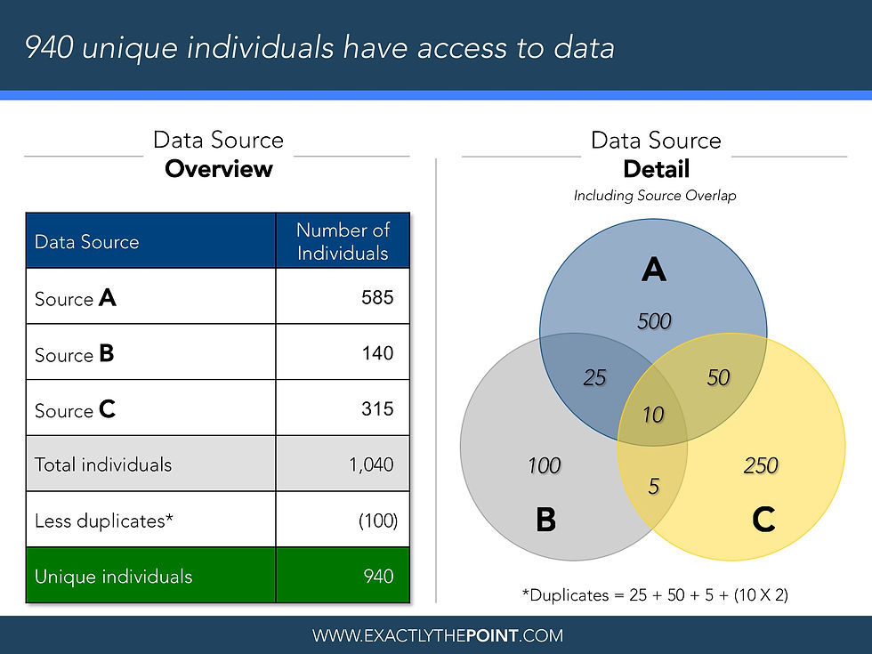
The traditional Venn Diagram with an accompanying table describing the data sets.
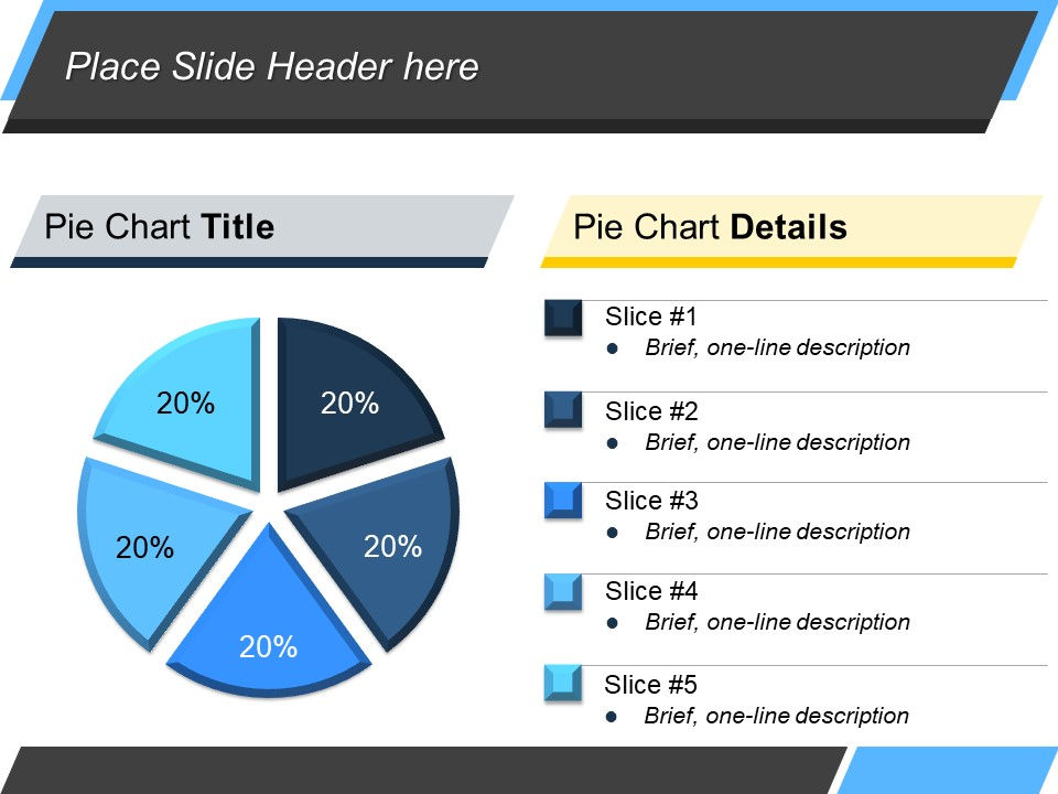
This professional, uncluttered pie chart allows elaboration by the presenter.

This progressive pie chart includes a separate pie to set apart each slice from the others.

A great way to compare, in this case, service attributes for two companies along a sliding scale.
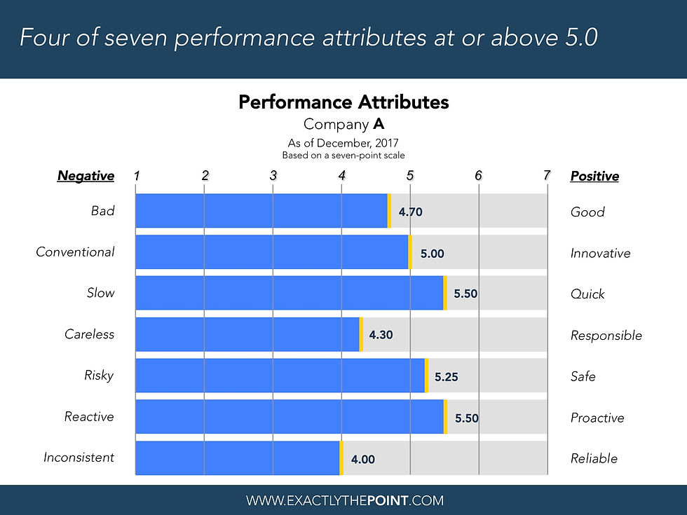
This slide depicts only one company with the values show in bar form with a gold highlight.

If you want to highlight several key elements or characteristics of an overall process, try this!

Waterfall charts are an effective way to show the component changes in a data series.
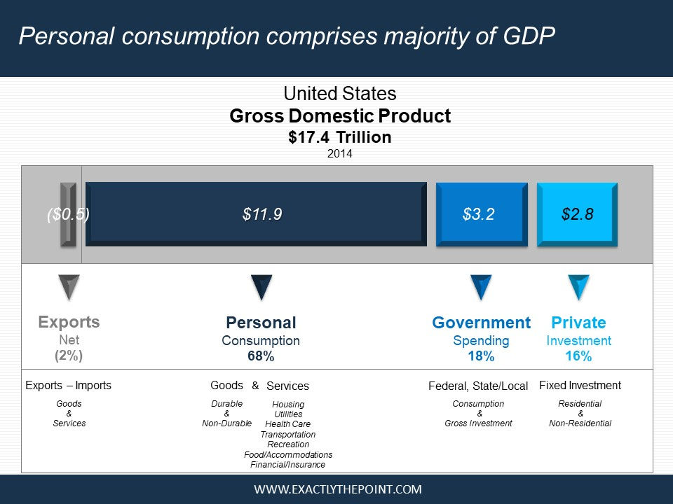
Not a traditional pie chart but equally effective, especially if a piece of the pie is a negative amount.
Use this simple yet effective slide to evaluate the potential outcomes of a decision.

This chart provides high-level information on the left with accompanying detail on the right.
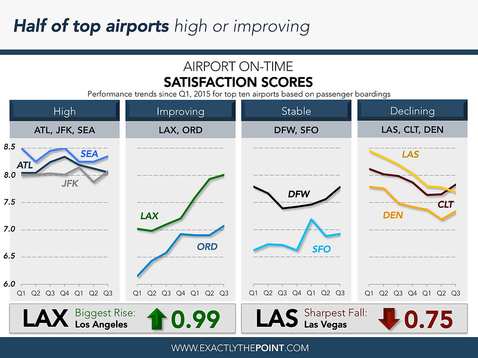
Trailing averages facilitate trend analysis by identifying trends over a "moving" time period.